Showing posts with label WPF Controls. Show all posts

Thursday, February 18, 2010

WPF Grid from ComponentOne

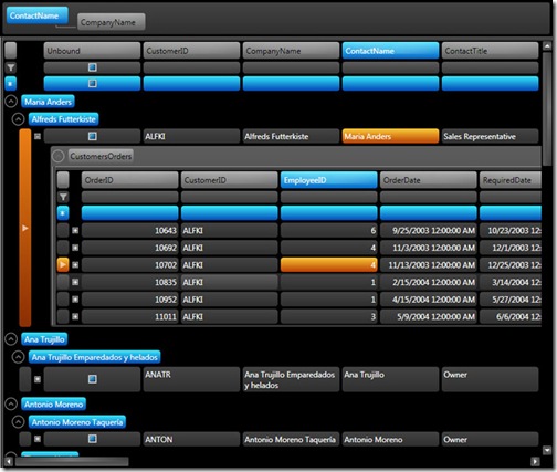
ComponentOne Grid™ for WPF takes the standard grid to a whole new level with dynamic data manipulation and a powerful carousel panel. Traditional grids allow you to display, format, and edit tabular data; Grid for WPF builds on this allowing you to adapt grid appearance, behavior, and layout to create a completely tailored UX.

wpf_datagrid_showoff

Features

  • Create an Interactive Experience with the Carousel Panel

    Grid includes a carousel panel, C1CarouselPanel that can be used to lay out any control with child elements that can be arranged in an arbitrary panel; for example, you can use C1CarouselPanel as ItemsPanel of ListBox or as MonthsPanel of Schedule for WPF's C1MultiMonthCalendar. Use the carousel panel for a unique, interactive data presentation.

    DataGrid_Carousel

  • Save Time with Built-in Data Views

    Change the appearance of Grid with multiple built-in data views, including unique carousel and card views as well as more traditional tabular horizontal and vertical grid view, or optionally, create your own custom data view.

  • Automatically Display Hierarchical Data

    Bind the grid to a table with child tables, and allow your users to expand the child tables under the current table to see related data. Grid for WPF automatically finds and displays hierarchical data relationships.

  • Interactively Manipulate Data at Run Time

    Easily group, sort, filter, resize, and reorder columns at run time all through simple drag-and-drop operations.

    c1gridwpf_tabularvertical02

  • 13 Built-in Themes Available

    Customize the appearance of your grid application with built-in Microsoft Office 2007, Windows Vista, and Microsoft Office 2003 themes, or create your own theme based on the included themes. Your polished grid is just a click away.

  • Create and Resize Excel-like Splits at Run Time

    At run time, users can easily create and resize Microsoft Excel-like horizontal and vertical splits that you can customize at design time.

    c1gridwpf_tabularvertical01

  • Enhance UI Performance with Virtual Grid Item Generation

    Grid for WPF supports user interface virtualization – by processing only information loaded in the viewable area, UI virtualization speeds up the user interface generation when working with a large data source list.

  • Universal Data Binding Simplifies Data Access

    Let Grid automatically generate grid columns or explicitly define columns yourself to customize column content and appearance. You can even explicitly define columns in an automatically generated grid.

  • Define Your Grid Layout Using One Template

    Define a custom content layout for multiple grid parts (such as data item, header, and filter bar) in a single universal item template.

  • Modify Your Grid without Leaving the Design Surface

    No more struggling with your grid layout. Quickly customize your grid item and grid header cells, and define cell placement by specifying panel-specific, attached properties on a column.

  • Control How Data is Displayed

    Use Grid to create and apply templates for specific data types. Grid can declaratively describe a mapping between a data type (represented by a grid column) and an item cell template (used to define the UI for cell viewing and editing), giving you more control over how data is displayed.

  • Export to Excel

    Grid now allows you to export to Microsoft Excel (.xls and .xlsx formats).

  • Quickly Access Data

    Grid provides an underlying data access model, which gives unified read/write access to a grid's source list data without needing to consider data source specifics. Save time using this straightforward approach.

  • 26 Supplementary XAML Files for UI Customization

    Customize your project's user interface with the ability to employ any of the 26 available XAML files providing built-in themes and data views.

  • Automatically Generate Columns

    Let Grid automatically generate grid columns or explicitly define columns yourself to customize column content and appearance. You can even explicitly define columns in an automatically generated grid.

  • Create Unbound Grids and Columns

    Manipulate data in an unbound grid, or add unbound columns to a bound grid.


Download(Free Trial)

Product page

Sunday, February 14, 2010

VIBlend Input Controls and Editors for WPF


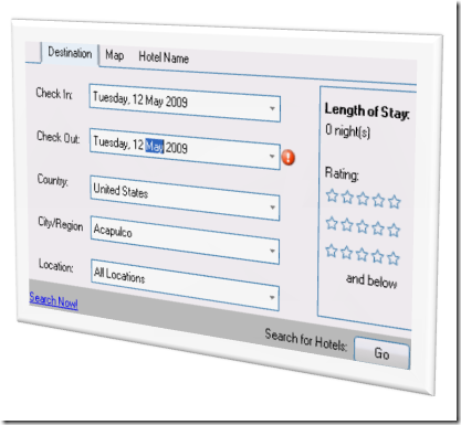
VIBlend Input Controls for WPF includes a set of user interface controls that simplify text entry, editing and validation. Data input is an important part of almost every business application. This package is ideal for building desktop interfaces that capture various types of text input like percentages, date and time values, masked text, and others.

free-wpf-editors

Read more

Saturday, October 13, 2007

Custom TreeView Layout in WPF

From this to
CustomTreeViewLayout_Before
this...

CustomTreeViewLayout_After

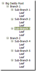
This article discusses how to customize the item layout in a WPF TreeView. The layout we will examine is quite similar to an "org chart", where each level of items is displayed in a horizontal row directly beneath their respective parent. Along the way we will see how the power of templates and styles in WPF can provide incredible flexibility for customizing an application's user interface.

This article is not for WPF beginners. It assumes that you already have knowledge of XAML, control templates, styles, triggers, hierarchical data templates, data binding, and other fundamentals of WPF.

Read more

Tuesday, October 9, 2007

WPF ribbon control


Company: devcomponents.com

Wpf-Ribbon™ is the fully compliant Office 2007 style Ribbon control developed from ground-up for Windows Presentation Foundation

We released world's first Ribbon control for Windows Forms back in 2005 and using that experience and new WPF platform we developed world's first WPF Ribbon control. Wpf-Ribbon™ is designed for developing professional business applications with WPF.

Partial list of Wpf-Ribbon™ features:
  • Supports all required Office 2007 UI design elements. For details see below...
  • Automatic intelligent Ribbon resizing
  • Application menu support
  • Contextual groups support
  • Complete Galleries support
  • Office 2007 styling for controls included, like ComboBox, StatusBar etc.
  • KeyTips support
  • Windows Vista Glass Support
  • Predefined color schemes Blue, Silver, Black
  • Create unlimited custom color schemes based on single color and one of our predefined color tables
  • Ribbon popup menu support
  • Quick Access Toolbar (QAT) with customization
  • Excellent integration with WPF Routed Commands
  • Right-To-Left (RTL) fully supported
  • XBAP support, use it in your Click-Once XBAP applications

Continue

Professional Docking Control for WPF


Company: devcomponents.com

Wpf-Dock is world's first Windows Presentation Foundation docking control with Office 2007 style developed from ground up to take advantage of new presentation layer.

We designed Wpf-Dock with simplicity in mind. We reduced number of classes you need to get familiar with to use the control and we carefully evaluated each property and method that is exposed on the control. Advanced docking layout engine we developed gets out your way and allows you to create very complex docking layout easily.

Here is just partial list of Wpf-Dock features:

  • Fully featured docking including Document docking
  • Easy document and docking window switching using Ctrl+Tab keys
  • Diamond docking guides for easy docking
  • Intelligent animation for docking transitions
  • Auto-hide capability
  • Save and Restore docking layout easily
  • Office 2007 Blue, Silver, Black styling included
  • Create unlimited custom color schemes based on single color and one of our predefined color tables
  • Right-To-Left (RTL) fully supported
  • XBAP support, use it in your Click-Once XBAP applications

Continue

Actipro Ribbon - WPF .NET Control


Company: Actipro

Demo

Actipro Ribbon is a control suite that implements an Office 2007-like user interface for the Windows Presentation Foundation (WPF) and meets all of the core Microsoft licensing requirements for implementation of a ribbon user interface.

Ribbon has been designed from the ground up to follow WPF best practices, be extremely configurable, use a command-driven model, and allow for reproduction of nearly all the user interface features found in Office.

Continue

SandDock Window manager


Company: divelements.com

SandDock is our award-winning window management software that enables dockable window and tabbed document functionality in applications that use it. The version for Windows Presentation Foundation (WPF) is able to leverage new technology to provide more visual features than its Windows Forms counterpart, such as smoothly animated transitions and 3D window switching - like the Flip-3D feature from Microsoft Windows Vista.

Broadly designed to mimic the user interface capabilities of Visual Studio 2005, by plugging SandDock into your application you can forget about the intricacies of window layout - instead, provide your windows to SandDock and let it present them with all the tools your users need for customization of the working area. Tool windows become dockable, sticking to the sides of your window in hierarchies chosen visually by the user, or they can be floated above your main window. Documents are presented in a tabbed fashion, with split views for easy comparison between content, or in a traditiona multiple document interface (MDI) layout.

Continue

XCEED DataGrid for WPF


Company: xceed.com

Demo (This demo requires Internet Explorer and .NET 3.0 or Vista)

  1. Not only the most poweful grid of its kind—with more features than any other offering—but also clearly the fastest, with a remarkably flexible and extensible object model, and reusable parts (datepicker / calendar control). Yet the standard version is absolutely free and fully functional! More than fills the void of the “missing” WPF grid: try it live here!
  2. Feature-rich! True lookless, 100% stylable and templatable WPF control; rich in-place editing; powerful grouping with UI virtualization; table and card views, with all Windows OS themes; a custom CollectionView for fine-grained control over the underlying data source; customizable group-level configurations with header and footer support.
  3. Outperforms anything else on the market! Can handle thousands and even hundreds of thousands of records at once.
Continue

xamDataPresenter


Company: infragistics

Whatever complex data constitutes the "it" in your application, the xamDataPresenter control for Windows® Presentation Foundation (WPF) is your one stop solution with its pluggable view architecture. Field layouts and template support make easy work of showing the data fields you want, where and how you want them. When the situation calls for a hierarchical data grid in traditional tabular format you plug in its GridView for all the features of the Infragistics xamDataGrid control like sort and group by field, add, edit, and delete records, and bands of nested child data records.

Alternately, the xamDataPresenter accepts a CarouselView to take advantage of data records moving along an animated path, special visual effects that will enthrall your users, and all the features of the Infragistics xamDataCarouselTM control. What about the next phenomenal presentation format that doesn't exist, yet? Choose the xamDataPresenter control for its open and extensible view architecture to prepare your presentation today for the next great thing tomorrow.

Continue

Saturday, September 22, 2007

Creating Custom WPF Controls

The advent of any new programming model generates a great deal of excitement, and the Windows Presentation Foundation (WPF) is no exception. This powerful UI framework provides a plush set of controls to construct rich user experiences. The controls provided within this coding quiver will help you hit the mark for the majority of your UI targets.

Continue